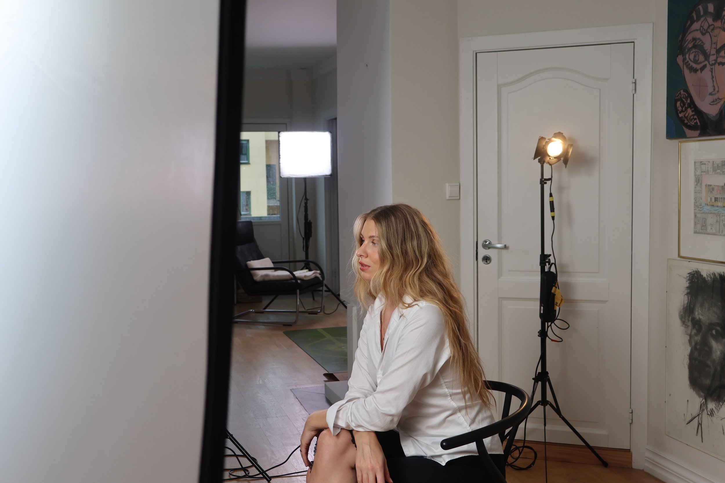
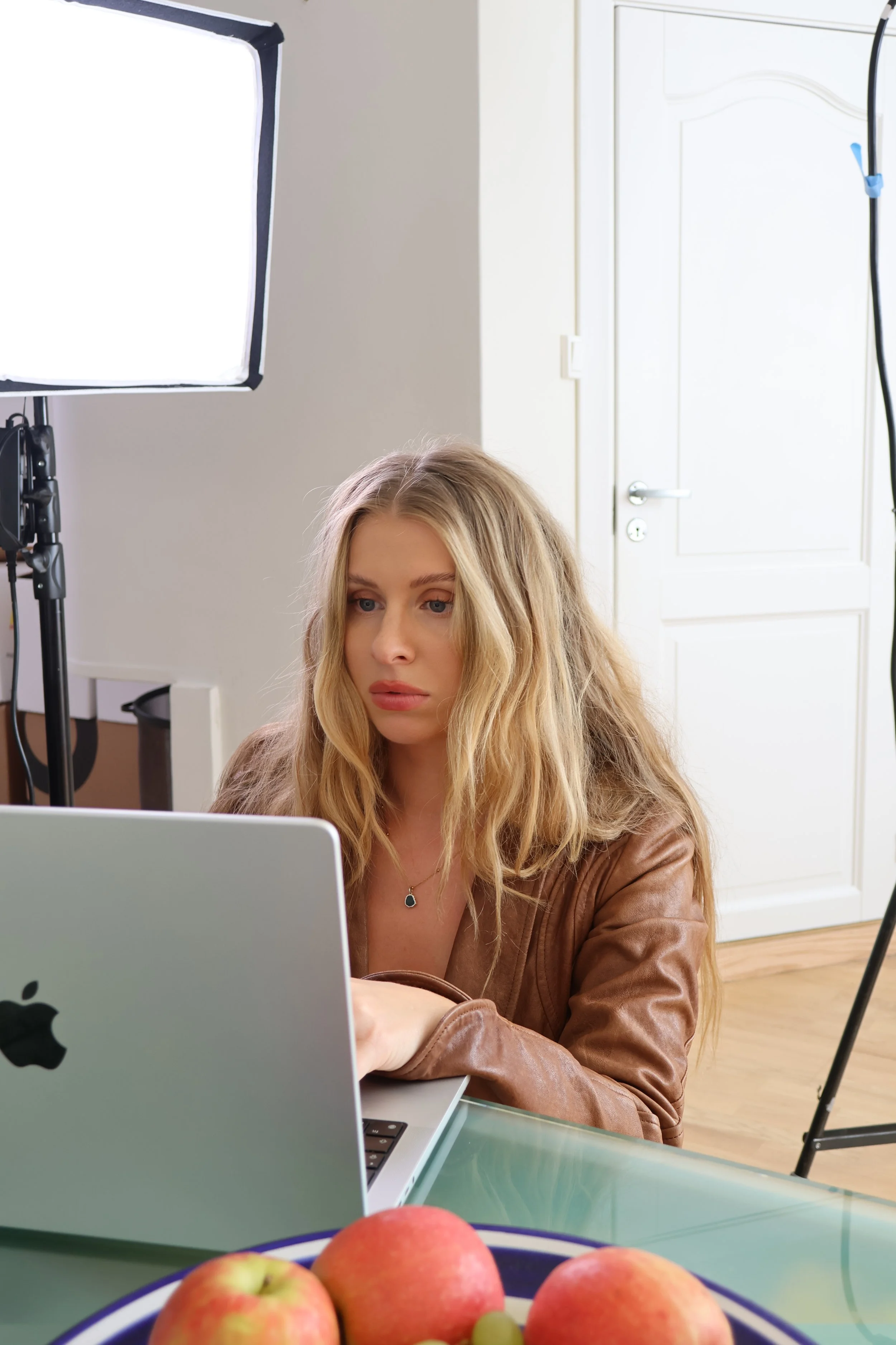
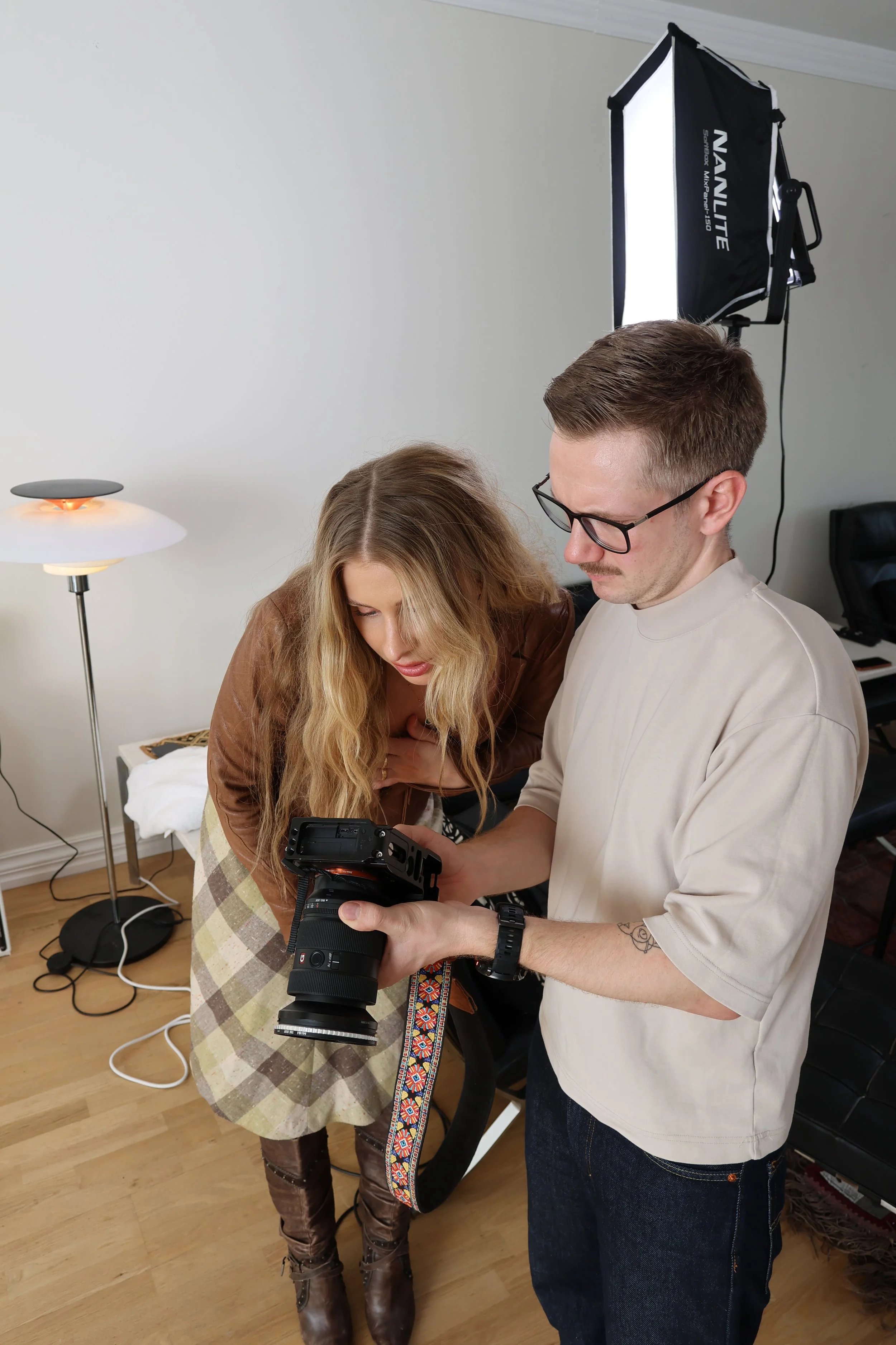
THE MAKING OF NOA & NECTAR
A very sweet welcome to behind the scenes of the creation of NOA & NECTAR.
For further articles, subscribe to our Substack
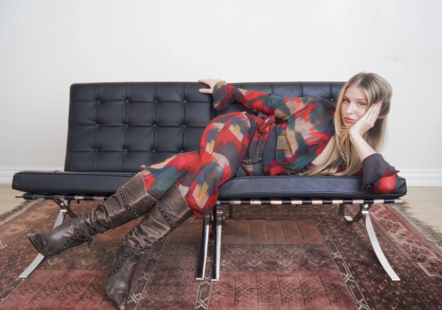
If anyone had told me back in spring that NOA & NECTAR would come to life this autumn, I would have laughed. Back then, it felt far too fragile to speak out loud. The months since have been an intense, beautiful unravelling—navigating the silent weight of imposter syndrome, learning to trust an inner knowing, and moving through the messy crossroads of pure enthusiasm and absolute frustration.
From the very beginning, two things were non-negotiable: I wanted to create a universe where duality is welcomed, and where complexity is celebrated rather than diluted. We are so often told to place ourselves in boxes—to “choose a niche,” define a singular aesthetic, curate one mood, or pick just one lane. Well, no thank you. Human nature is vast, layered, and delightfully contradictory. We are not meant to reduce ourselves to a single note.
For a long time, I felt that friction in both worlds. In the spiritual community—which holds so much warmth, presence, and capacity—a hunger for high aesthetics and contemporary design can sometimes be met with hesitation. Meanwhile, in the polished, fast-paced modern world, leaning into ritual, spirituality, and ancient practices can easily be dismissed as esoteric or foreign. NOA & NECTAR was created precisely to hold space for both: the grounded and the glamorous, the sacred and the modern, the stillness and the statement.
In typical creative fashion, I wanted to jump straight into the tactile details. I dove headfirst into color palettes, fonts, and moodboards, only to be stopped in my tracks by Maddison Utendahl’s reminder:
“A LOGO IS NOT A BRAND”
That insight forced a pause. It asked me to sit with the void before trying to decorate it. So I returned to the roots:
What does NOA & NECTAR actually stand for?
What emotional resonance do I want to evoke when someone enters this world?
What is the core message beneath the surface?
Only when the foundation felt solid and rooted could the visual language begin to emerge—using tone, typography, and texture not merely for decoration, but to amplify an emotion.
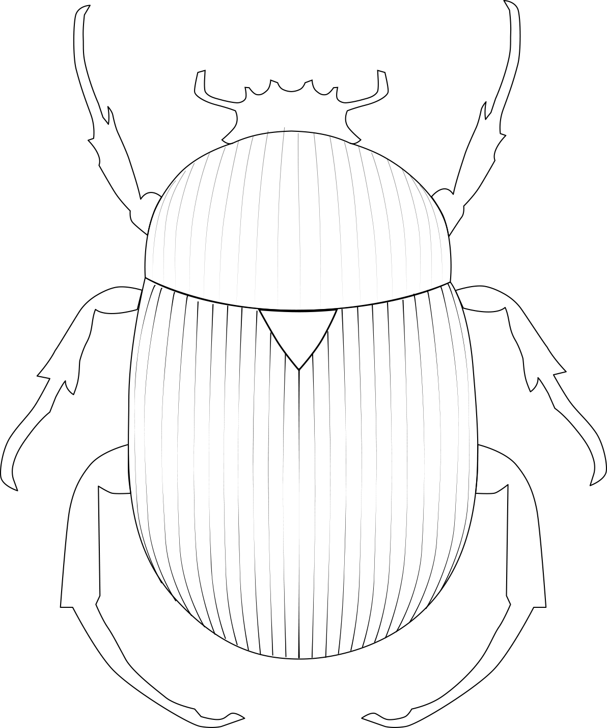
Once the logo found its form, I felt strongly that we needed an anchor, a symbol with heritage and soul. Just as Ralph Lauren has the polo player or Hermès has the horse and carriage, I wanted an emblem that carried an enduring narrative.
Enter the Scarab beetle.
In ancient Egyptian mythology, the scarab is an emblem of continuous renewal, resilience, and celestial guidance—a disciple of the sun. At first glance, a beetle is an insect—earthbound, armored, unconventional. But that tension was precisely what captivated me. Its silhouette is simultaneously compact and sculpted, delicate yet resilient. The scarab reminds us that transformation doesn't come from a sterile, perfect place; it comes from moving through the earth, grounded in truth, navigating by the light.
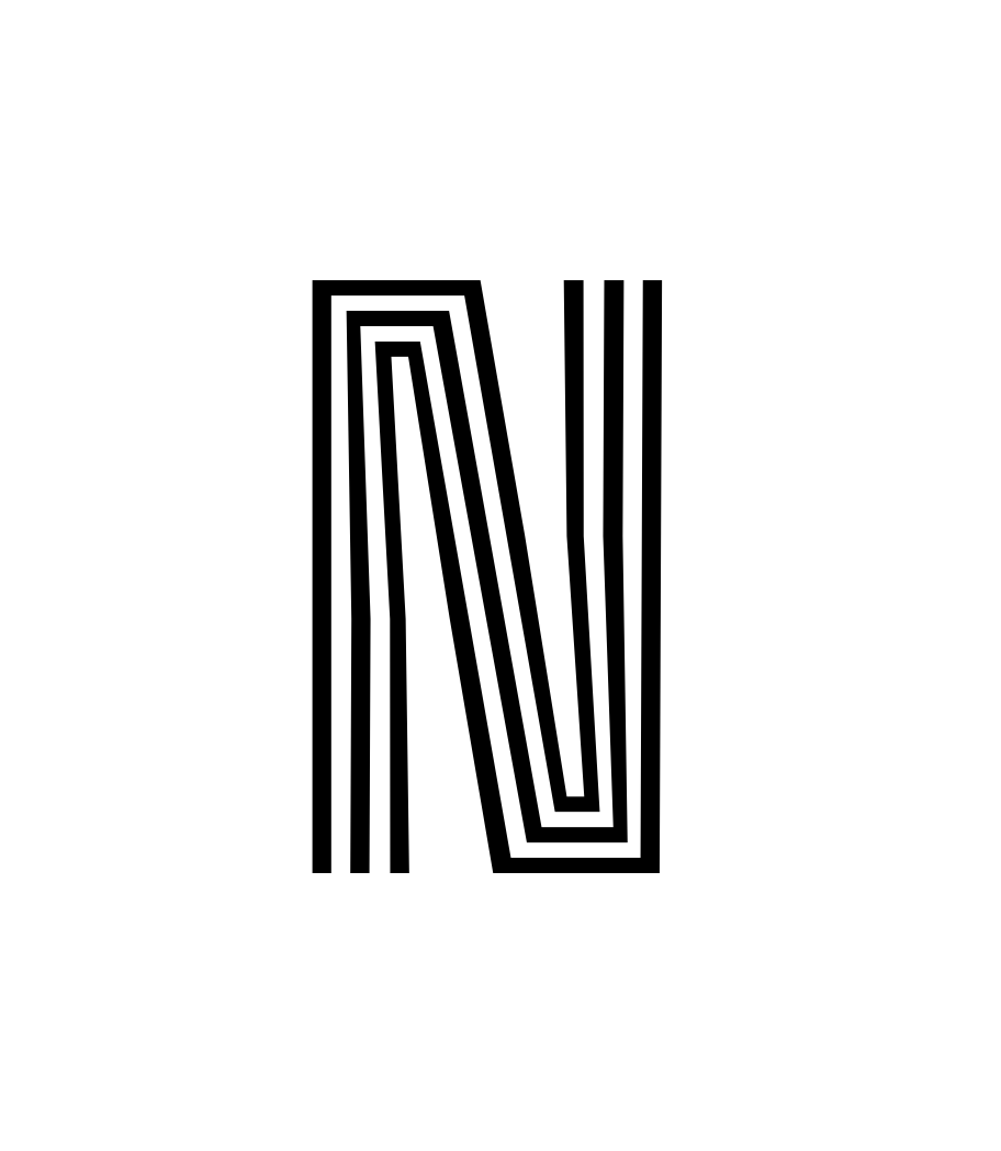
This intentional interplay between opposites shaped our typography as well. The core NOA & NECTAR wordmark carries a subtle, soft, feminine curve, while our headlines stand tall with a bolder, more architectural, masculine energy. At the center—at the very heart of the brand—lives the feminine; framing it in confident lines is the masculine. For the body text, we sought something timeless with quiet character and effortless legibility.
Like every choice made within NOA & NECTAR, the direction was steered by instinct and intuition. I did not follow the calculated marketing playbooks, nor did chased what the algorithm deemed "clever" or trendy this season. The guiding compass has always been far simpler: Does this feel authentic, and does it feel right? And it truly does.